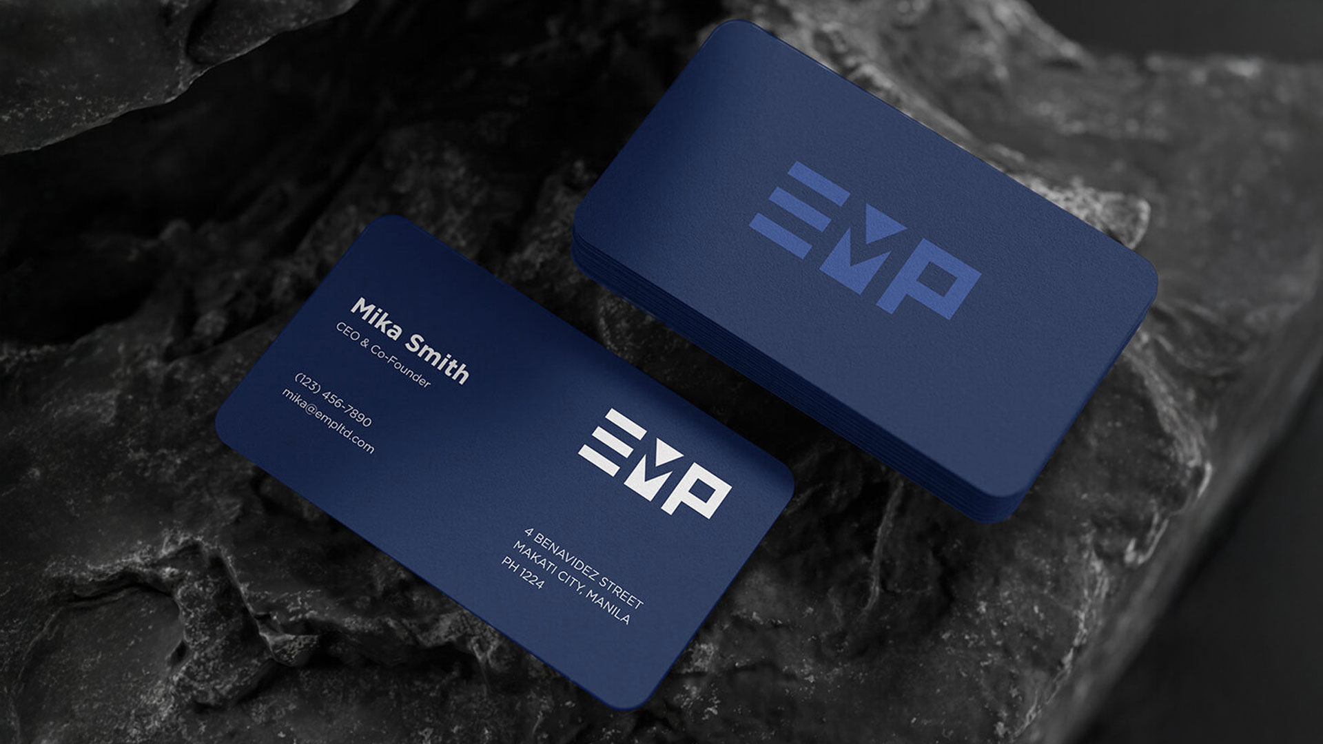
EMP Limited Ads
Logo Redesign & Brand Identity

Client
EMP Limited Ads
Role
Logo Redesign + Brand Identity
I led the logo redesign and developed a complete brand guideline for EMP Limited Ads, a young marketing agency specializing in Web3 campaigns. The goal was to create an identity that felt professional yet adaptable enough to grow with them as they scale.
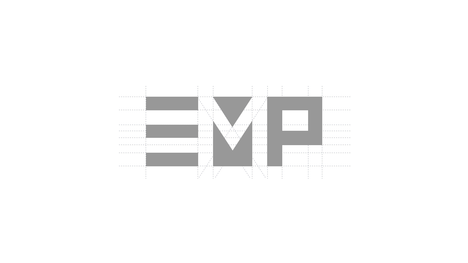
The original logo leaned on heavy gradients and tilted text, which made it feel dated and difficult to read. For the redesign, I focused on simplicity and strength. I used solid geometric shapes to create a mark that feels sharper, more confident, and aligned with the blockchain space the agency serves while keeping the essence of the original logo intact.
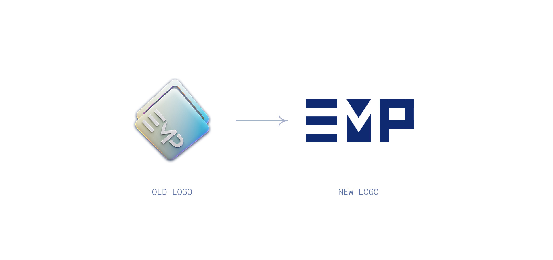
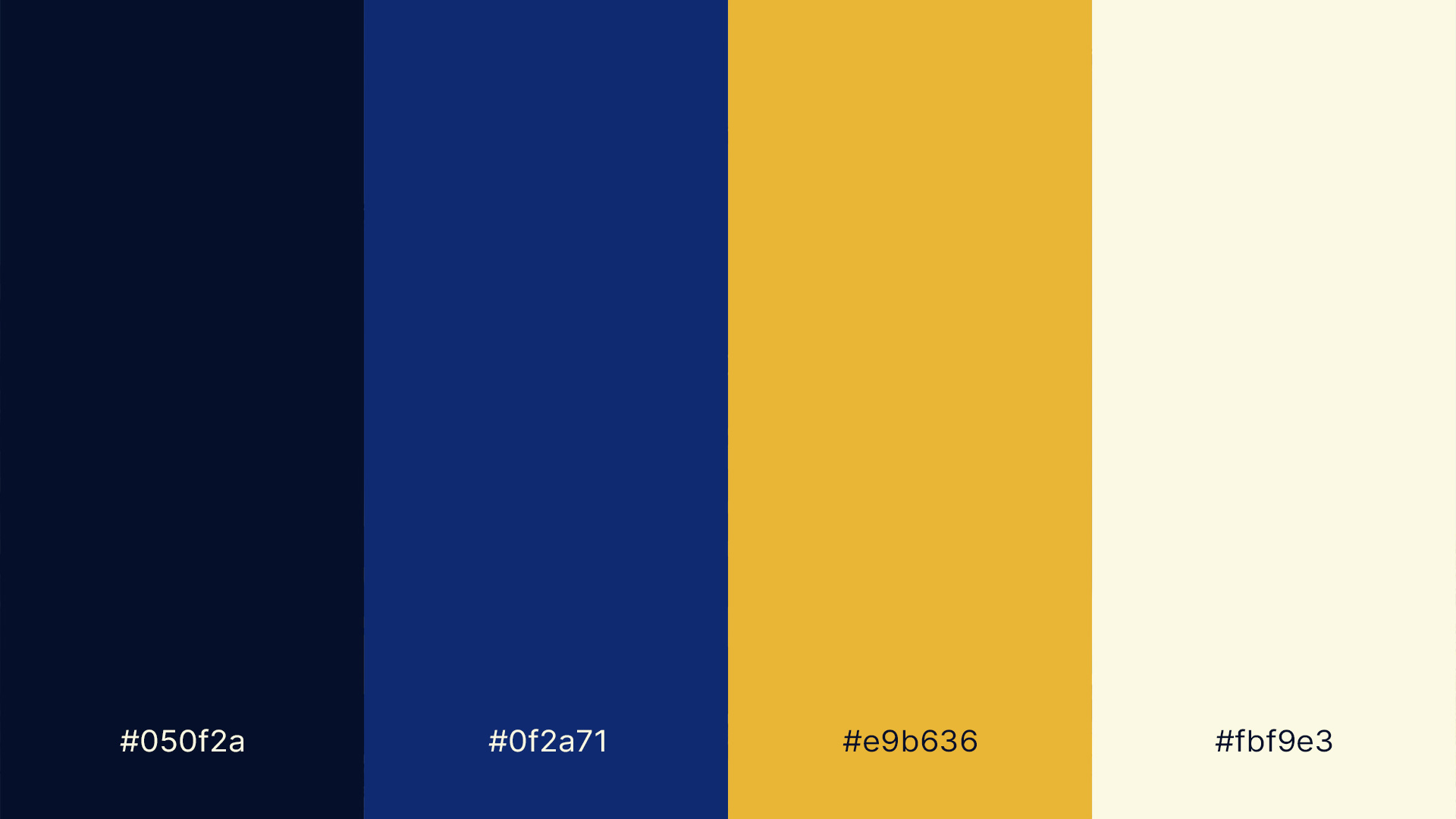
The challenging part was that the old logo wasn’t doing the brand any favors. It felt dated and hard to read. The way I approached it was by stripping things down to their essence. Instead of hiding inside a shape, I rebuilt the mark using bold and solid geometry and negative space.


