
Cinchblock
Motion Identity
Client
Cinchblock
Role
Art Direction, Motion Systems
Cinchblock is a blockchain marketing agency that helps blockchain projects unlock growth through growth hacking, influencer marketing and community building. My role wasn’t simply to animate their logo. It was to translate the idea they already owned—unlocking growth—into a visual story that people could understand in seconds.
The Challenge
Blockchain marketing agencies often sound interchangeable. Most talk about growth, community, and performance, making it difficult for audiences to understand what makes one agency different from another. Cinchblock already had a strong positioning statement: unlocking growth. The opportunity wasn’t to invent a new message but to give that message a visual identity. Instead of another logo animation, I wanted to create a motion system that made their promise feel tangible.
The Approach
Rather than illustrating blockchain itself, I focused on the transformation Cinchblock creates for its clients.
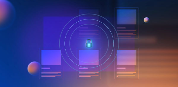
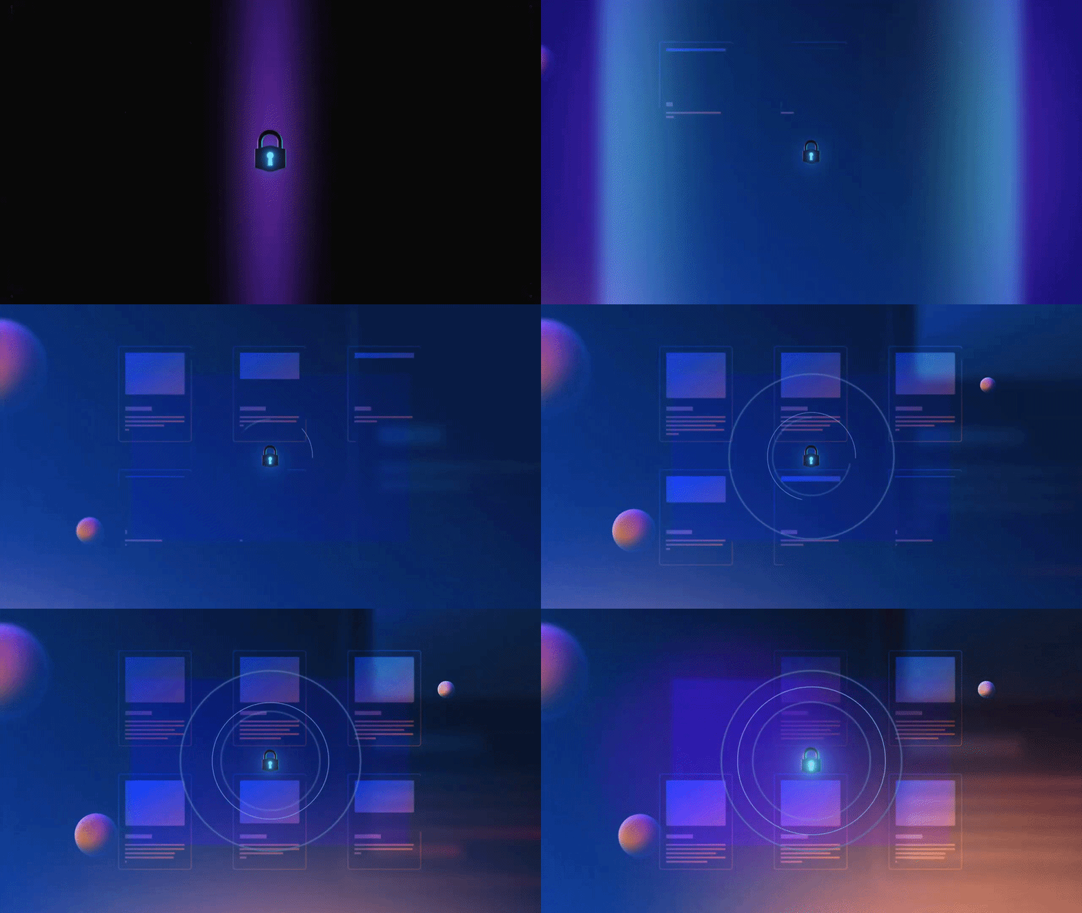
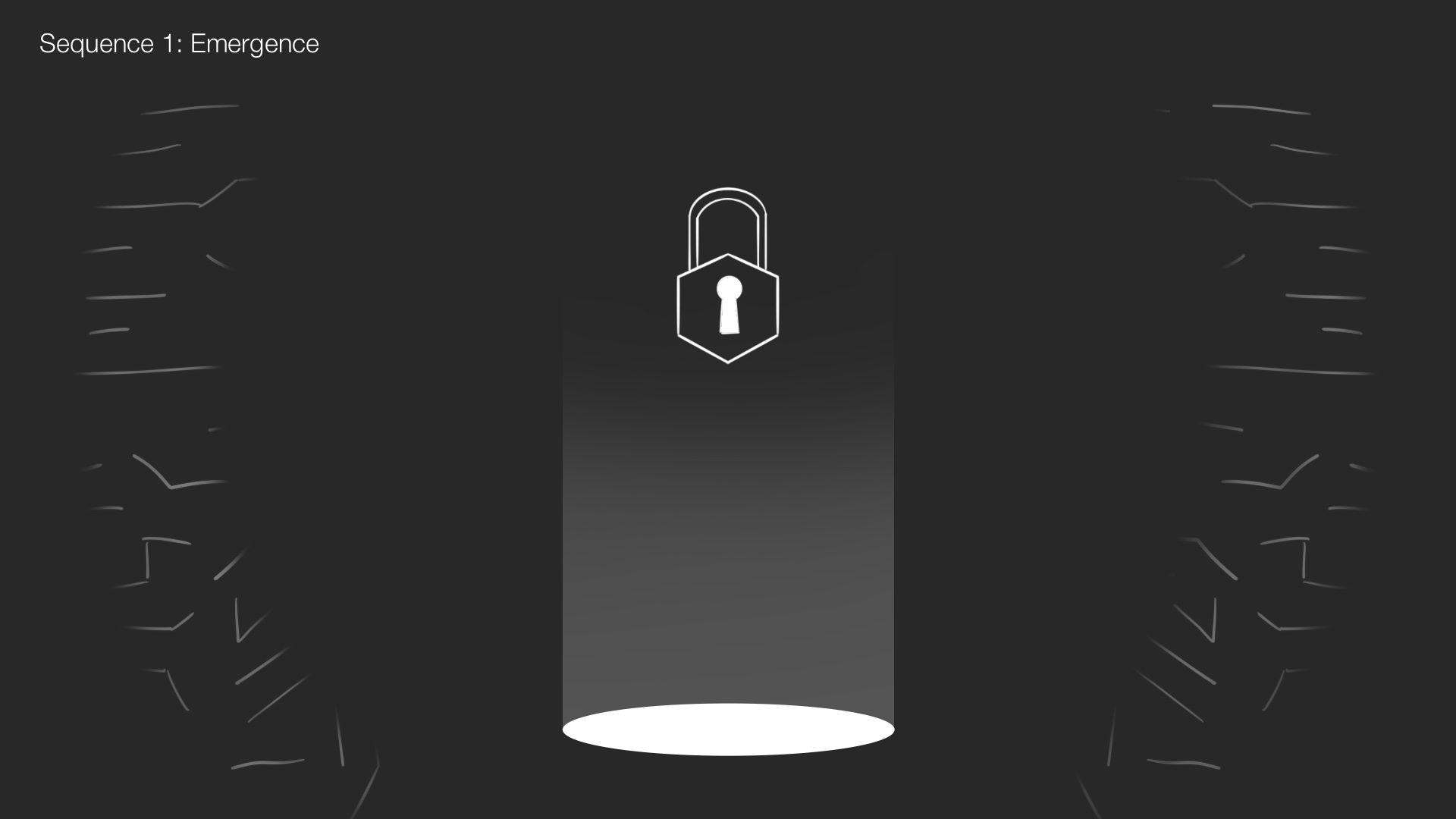
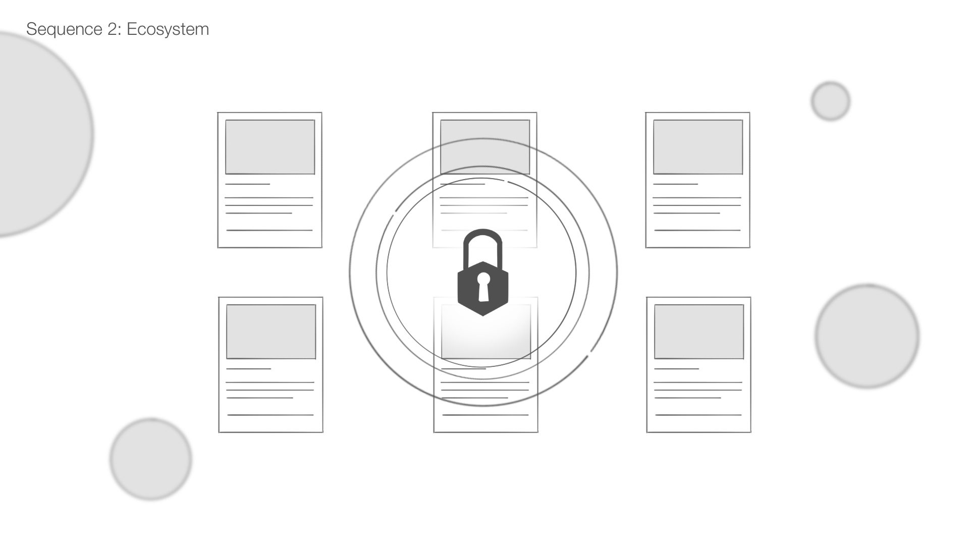
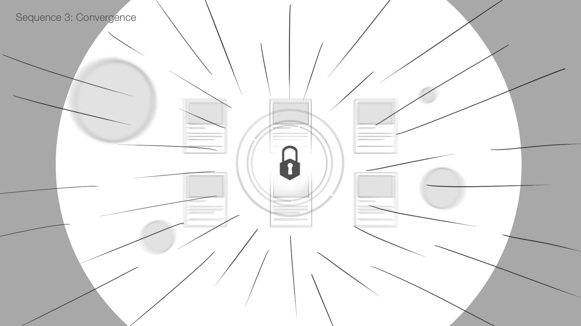
The story begins in darkness, representing opportunity that hasn’t been realized yet. A lock emerges and activates, sending out a wave that gradually reveals the technology hidden beneath the surface. As the environment comes to life, individual elements begin to orbit the lock, representing the different services that work together to support growth. By the end of the sequence, everything converges into the Cinchblock logo.
Every visual decision reinforces the same idea: growth isn’t something that’s added, it’s something that’s unlocked. Instead of explaining blockchain, the animation explains Cinchblock’s role within it.
The logo already carried recognition and trust, so replacing it would have thrown away years of brand value without actually fixing the deeper inconsistencies. We saw an opportunity to evolve everything surrounding it instead, and once we made that single decision, it ended up shaping every design choice that followed.

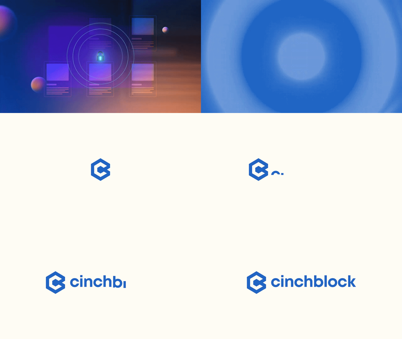
Designing a Motion System
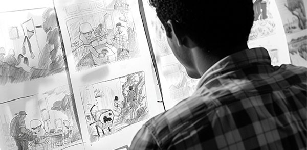
Before opening a motion design software, I storyboarded the entire sequence in four stages:
Emergence – Ecosystem – Convergence – Resolution
Breaking the sequence into clear stages helped validate whether the concept communicated clearly before any animation work began. If the story didn’t work as simple frames, more rendering wouldn’t solve the problem.
Thinking about the sequence as a system also shaped how it was built. Each stage could stand on its own, making it possible to repurpose parts of the animation into different assets without creating new work from scratch.
Outcome
The final deliverable became more than a logo reveal.
Rather than treating the project as a single animation, I designed it as a collection of reusable motion components.
Each stage of the sequence was built to work independently while still contributing to the larger story. The portal, lock, shockwave, UI elements and logo became modular assets that could be recombined across different touchpoints.
This meant the same visual language could scale beyond the homepage into social content and future brand communications without creating new animations from scratch.