AlikeAudience
Visual Identity System

Client
AlikeAudience
Role
Visual Identity
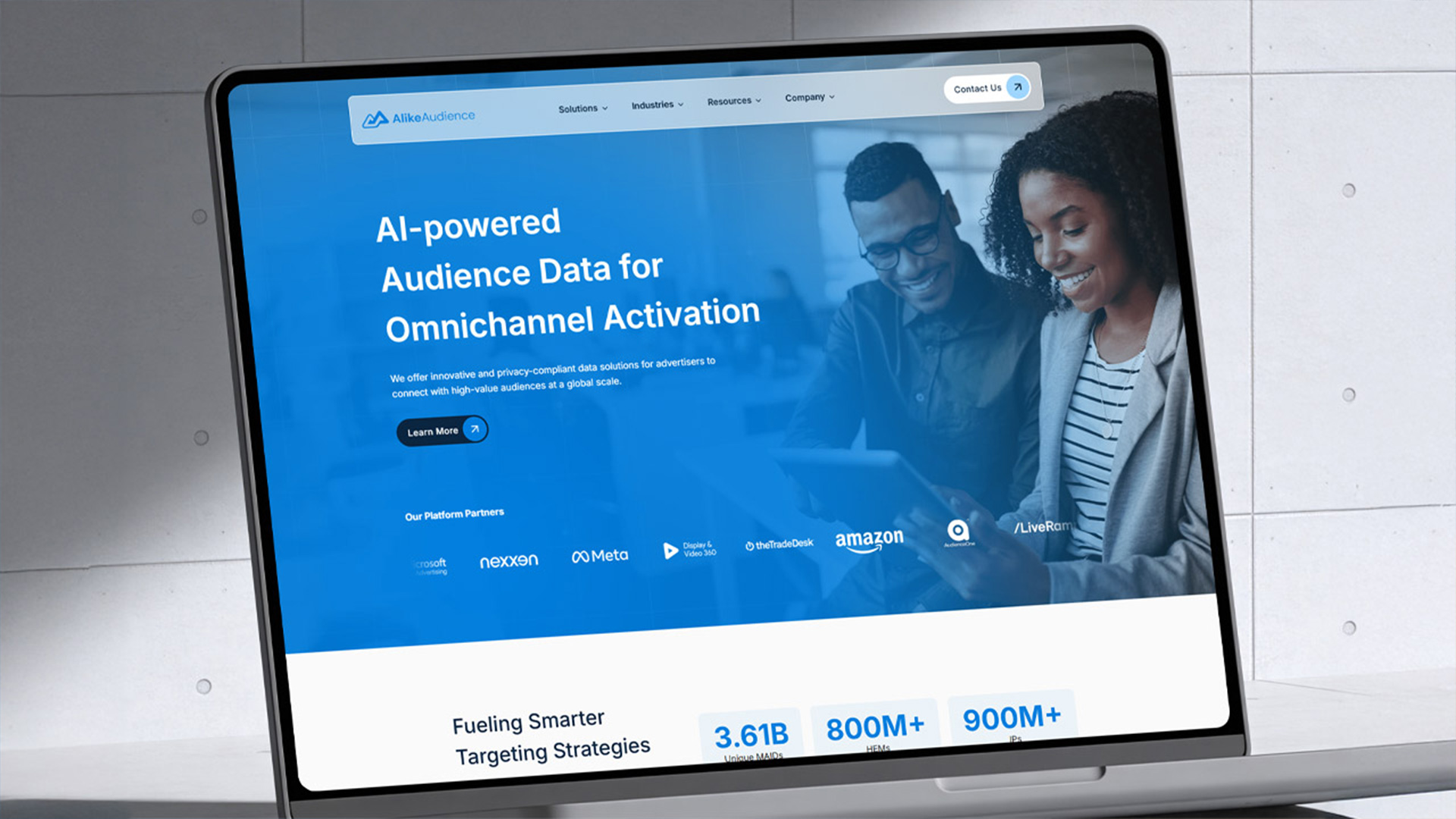
I led the visual identity refresh for AlikeAudience, a data science company looking to modernize its presence in the rapidly evolving audience targeting space. The goal was to breathe new life into an outdated brand system, providing a sophisticated set of guidelines that felt contemporary while maintaining the equity of their established logo.

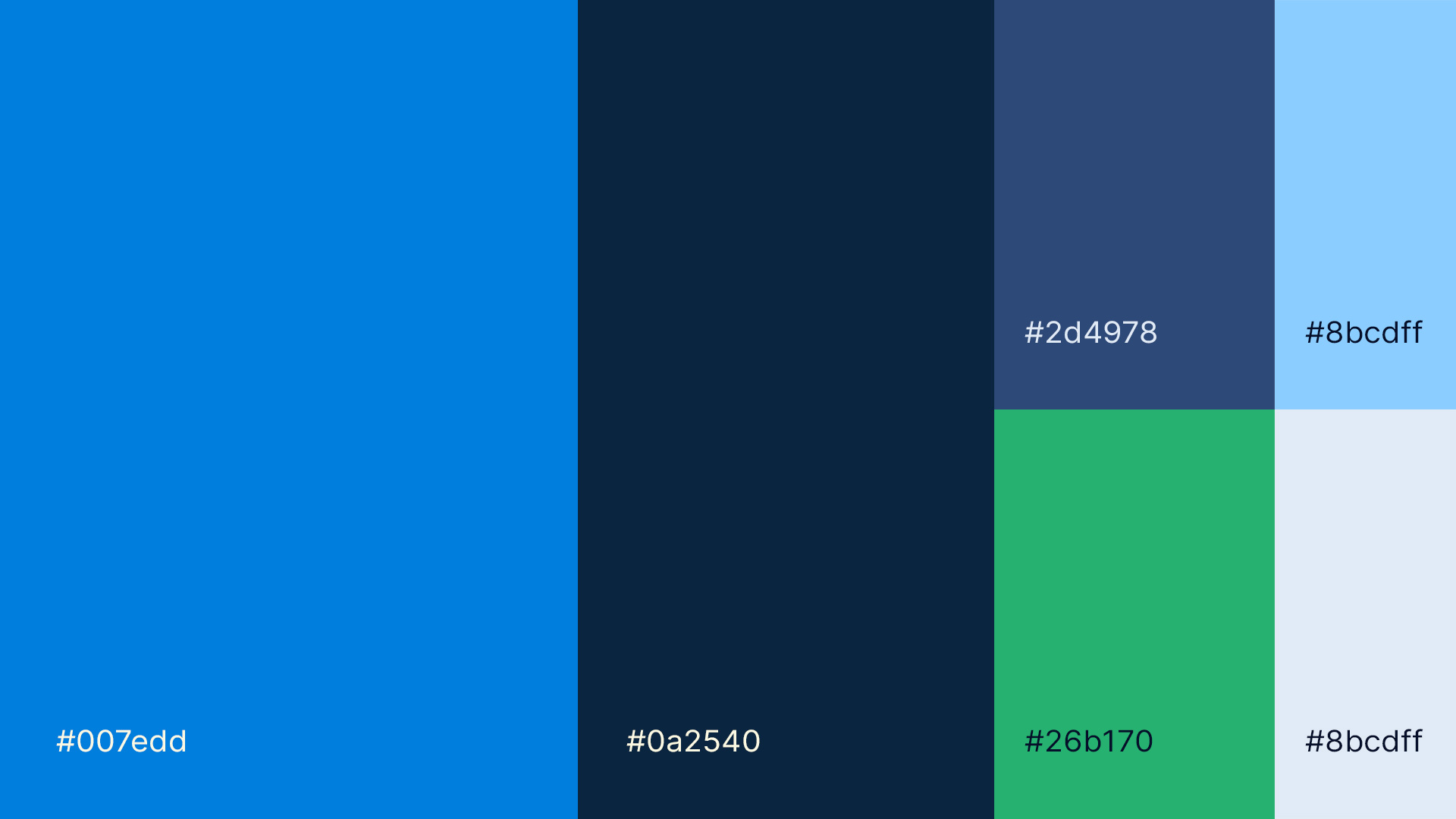
The core of this project was a “evolution, not revolution” approach. While we kept the original logo as our anchor, everything else—the fonts, the colors, and the layouts—got a much-needed overhaul. I stuck with their signature blue but built a broader palette around it, adding new shades that make the brand easier to navigate and much friendlier to look at on a screen.
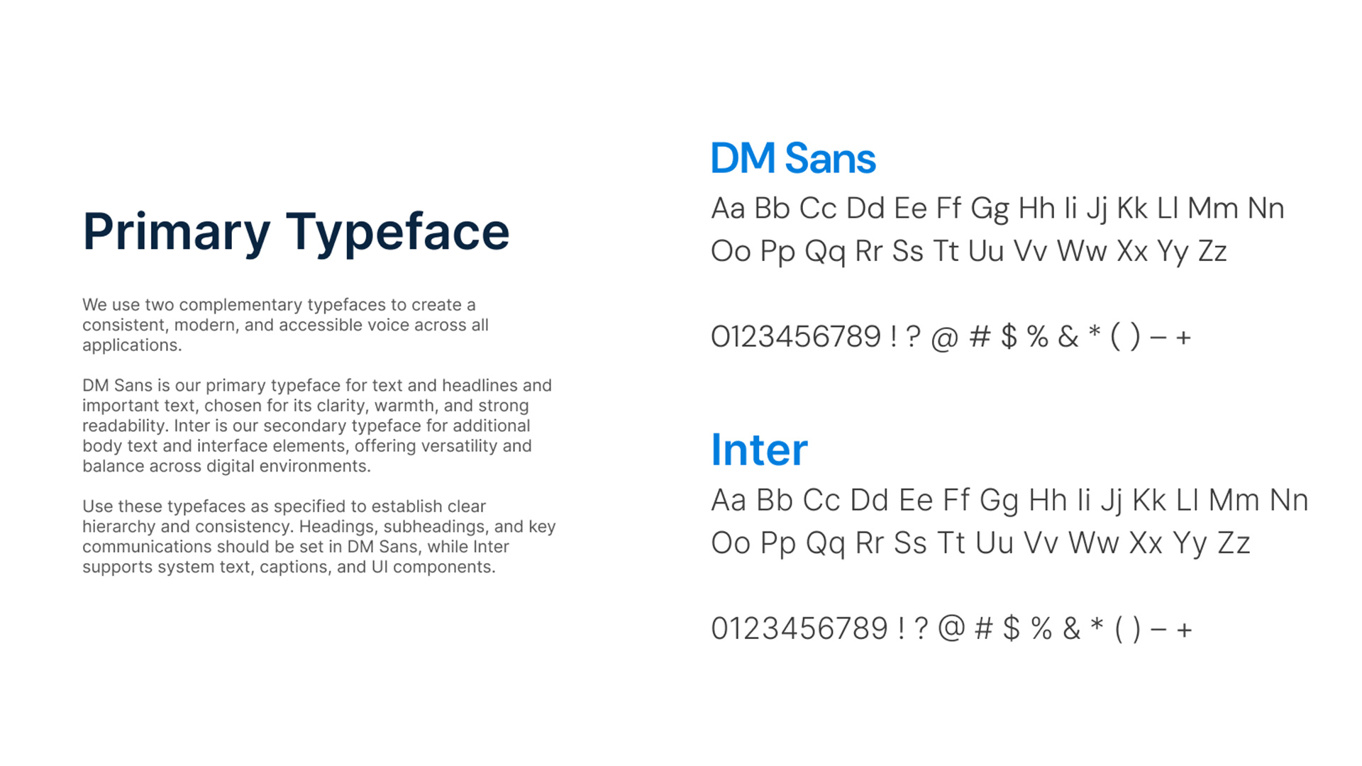
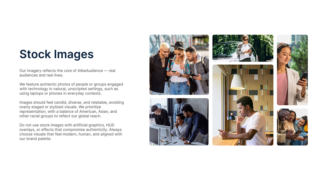
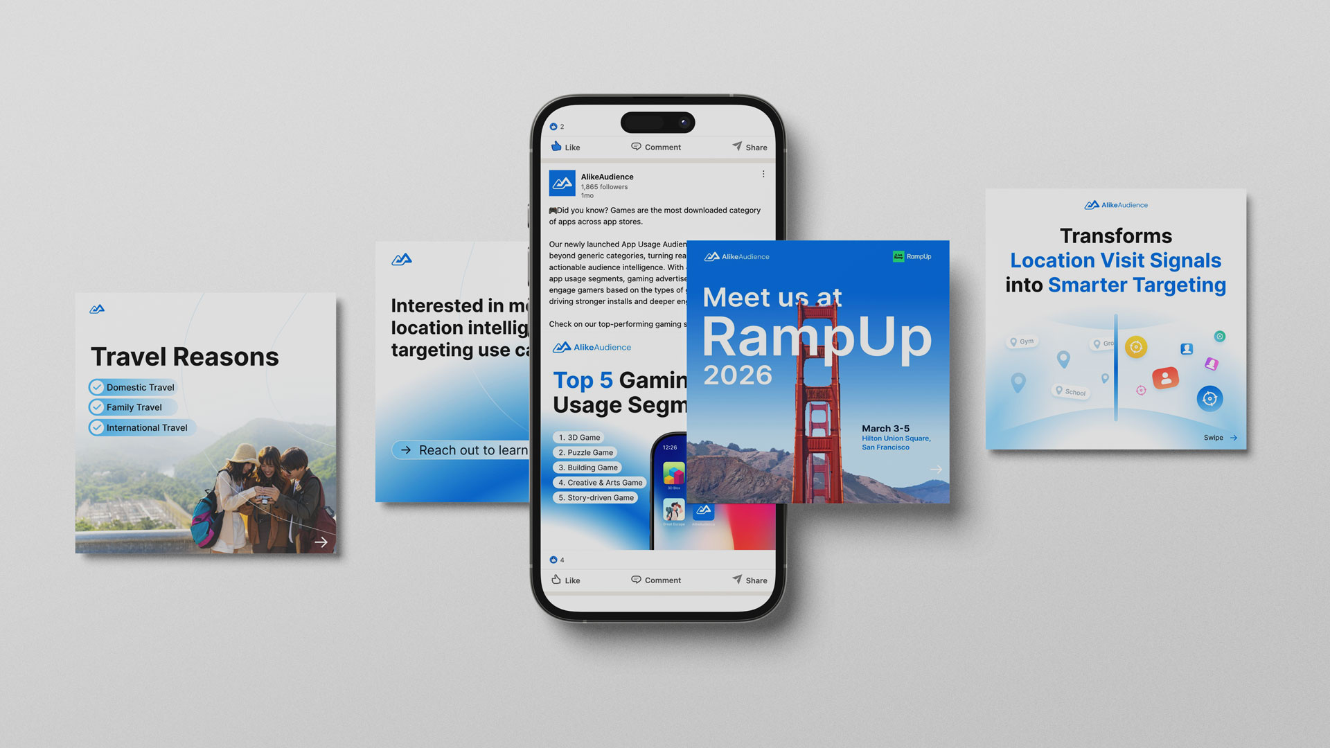
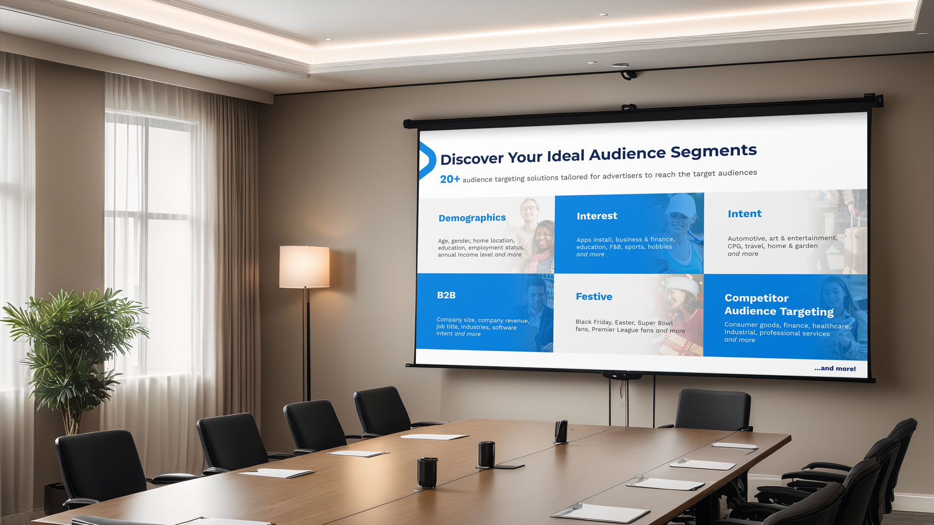
Beyond the visual updates, I built a clear and flexible brand system that the marketing team could actually use day to day. This included layout principles, typography rules, color usage guidance, and scalable templates for campaigns, presentations, social content, and sales materials. The focus wasn’t just to make the brand look modern, but to create a system that could support ongoing growth and keep everything consistent across different channels and teams.
